Saturday, July 5, 2025

Data Preparation in Power BI: Power Query Editor, Data Transformation & DAX Guide

Data preparation is one of the most critical steps in building powerful and insightful dashboards in Power BI. Before creating visualizations, it's essential to clean, transform, and structure your data for accuracy and performance. In this blog, we’ll walk through the key elements of data preparation in Power BI, including an introduction to Power Query Editor, common data transformation techniques, and how to create calculated columns and measures using DAX.

Data Preparation in Power BI


What is Data Preparation in Power BI?

Data preparation in Power BI involves importing raw data from various sources, cleaning it, reshaping it, and transforming it into a structured format ready for analysis. This process ensures your reports and dashboards reflect accurate and actionable insights.


Introduction to Power Query Editor in Power BI

The Power Query Editor is a built-in data transformation tool in Power BI Desktop. It helps you connect to data sources, clean and reshape the data, and define rules for how the data should be loaded into your Power BI model.

Key Features of Power Query Editor:

  • Intuitive user interface with step-by-step transformations
  • Applied Steps pane to track each data change
  • Query dependencies and relationships view
  • Powerful M language for advanced transformations

Accessing Power Query Editor:

  1. Open Power BI Desktop
  2. Click Home > Transform Data
  3. The Power Query Editor window will open with your imported dataset


Common Data Transformation Techniques

Power BI supports a wide range of transformation techniques to prepare your data. Here are some essential ones:

1. Merge Queries (Joins)

  • Combine data from two or more tables using common columns
  • Types of joins: Left, Right, Inner, Outer, Full
  • Example: Merge a Customer table with Orders to get customer-wise orders

Step: Home > Merge Queries > Choose Join Type > Match Columns


2. Append Queries

  • Stack rows from one table below another (like UNION in SQL)
  • Useful when combining data from multiple sources with the same structure

Step: Home > Append Queries > Select tables to append


3. Pivot and Unpivot

  • Pivot: Turn unique values from a column into new columns
  • Unpivot: Transform columns into rows for normalization

Step: Transform > Pivot Column or Unpivot Columns


4. Filtering and Sorting Data

  • Remove unnecessary or duplicate rows
  • Apply filters to focus on specific data
  • Sort columns to improve data readability

Step: Use filter icons or right-click column > Remove Duplicates


5. Changing Data Types and Renaming Columns

  • Set correct data types (Text, Number, Date, etc.) for consistency
  • Rename columns for clarity

Step: Transform > Data Type / Right-click > Rename


Cleaning and Shaping Data

Data cleaning ensures your dataset is free from errors, inconsistencies, and irrelevant information.

Common Cleaning Techniques:

  • Remove blank rows or columns
  • Replace errors and null values
  • Trim whitespace or unwanted characters
  • Split columns using delimiters
  • Group data by key fields

All these steps are available under Transform and Home tabs in Power Query Editor.


Creating Calculated Columns and Measures Using DAX

Once your data is loaded into Power BI’s data model, you can create Calculated Columns and Measures using DAX (Data Analysis Expressions) to enhance your analysis.


What is DAX?

DAX is a powerful formula language in Power BI that allows you to create custom calculations, aggregations, and business logic.


1. Calculated Columns

A Calculated Column is created row by row for each record in a table. It’s useful when you need a new field derived from existing data.

Example:

FullName = Customers[FirstName] & " " & Customers[LastName]

Use Case: Combine two fields, classify categories, or create flags.


2. Measures

Measures perform aggregations like SUM, AVERAGE, COUNT, etc., and are calculated dynamically in visuals.

Example:

TotalSales = SUM(Sales[Amount])

Use Case: Total sales, average profit, percentage share, KPIs


3. Popular DAX Functions for Beginners

  • CALCULATE() – Modify filter context
  • IF() – Conditional logic
  • FILTER() – Apply row-level filtering
  • RELATED() – Fetch data from related tables
  • DISTINCTCOUNT() – Count unique values


Best Practices for Data Preparation in Power BI

  • Always clean your data before modeling or visualization
  • Avoid excessive calculated columns; use measures for aggregations
  • Use naming conventions for tables and fields
  • Minimize data load by removing unwanted columns and rows
  • Apply transformations in Power Query to reduce memory usage


Conclusion

Effective data preparation in Power BI is the foundation for successful reporting and data analysis. The Power Query Editor helps you clean and shape raw data, while DAX allows you to add powerful logic and calculations. Together, they turn complex data into clean, structured, and insightful dashboards.

Whether you're building your first report or optimizing existing ones, mastering data preparation will significantly enhance your Power BI skills.


Keywords:

  • Data Preparation in Power BI
  • Power Query Editor in Power BI
  • Data transformation techniques in Power BI
  • How to clean data in Power BI
  • Create calculated columns in Power BI
  • Power BI DAX tutorial
  • Power BI pivot and unpivot
  • Power BI merge and append queries
  • Shaping data in Power BI
  • Data modeling Power BI

Search Description:

Master data preparation in Power BI with this step-by-step guide on using Power Query Editor, transforming data, and creating calculated columns and measures using DAX.

Labels: , , , , , ,

Getting Started with Power BI: A Beginner’s Guide to Data Visualization

Power BI is one of the most powerful business intelligence tools in today’s data-driven world. Whether you're a data analyst, business user, or manager looking to make smarter decisions, learning Power BI can open up a world of possibilities. This blog post will guide you through everything you need to know to get started with Power BI – from installation to creating your first dashboard.

PowerBI


Why Choose Power BI?

If you’re wondering why you should invest time learning Power BI, here are a few compelling reasons:

  • Easy to Use: No need for coding knowledge.
  • Free Desktop Version: Power BI Desktop is completely free to download and use.
  • Scalability: Suitable for individual users and large enterprises alike.
  • Microsoft Ecosystem: Seamless integration with Excel, Azure, and other Microsoft tools.


Step 1: Install Power BI Desktop

Getting started is simple:

  1. Go to the official Microsoft Power BI site
  2. Download and install Power BI Desktop
  3. Launch the application and sign in using your Microsoft account


Step 2: Connect to Data

Power BI allows you to connect to a wide range of data sources, including:

  • Excel workbooks
  • SQL databases
  • SharePoint lists
  • Web APIs
  • Google Analytics
  • Salesforce

To import data:

  • Click Home > Get Data
  • Choose your data source
  • Load or transform data using Power Query Editor


Step 3: Clean and Transform Data

Use Power Query Editor to clean, shape, and transform your data:

  • Remove null values
  • Filter rows
  • Rename columns
  • Merge and append queries
  • Create calculated columns

Proper data transformation ensures your reports are accurate and insightful.


Step 4: Create Visualizations

Power BI offers a rich library of visuals such as:

  • Bar and column charts
  • Pie and donut charts
  • Maps and tree maps
  • Line graphs
  • KPIs and gauges
  • Custom visuals from the marketplace

Simply drag and drop fields into the visualization pane to create compelling charts.


Step 5: Build Your Dashboard

Combine multiple visuals into a report:

  • Add multiple pages if needed
  • Apply filters and slicers for interactivity
  • Use bookmarks and drillthrough for advanced navigation
  • Apply themes for consistent branding


Step 6: Publish to Power BI Service

To share your report online:

  1. Click Publish in Power BI Desktop
  2. Sign in to Power BI Service (app.powerbi.com)
  3. Share dashboards with your team or embed in apps

You can also schedule automatic data refreshes for up-to-date insights.


Tips for Power BI Beginners

  • Start with small datasets
  • Learn DAX (Data Analysis Expressions) for advanced calculations
  • Explore the Power BI Community for free resources and help
  • Keep your visuals simple and meaningful
  • Use Tooltips and Titles to guide your audience


Final Thoughts

Power BI is a game-changer for data visualization and analytics. With its user-friendly interface, rich features, and integration capabilities, it empowers anyone to turn data into actionable insights.

Whether you're a student, analyst, or business owner, getting started with Power BI is your first step toward smarter decisions and better business outcomes.


Frequently Asked Questions (FAQs)

Q1. Is Power BI free?
Yes, Power BI Desktop is free. Power BI Pro (for sharing and collaboration) requires a subscription.

Q2. Do I need to know coding?
No. Power BI is user-friendly and works well without any coding. But learning DAX and M can enhance your capabilities.

Q3. What are the main components of Power BI?
Power BI Desktop, Power BI Service (cloud), Power BI Mobile App, and Power BI Gateway.


Keywords 

  • Getting Started with Power BI
  • Power BI tutorial for beginners
  • How to use Power BI
  • Power BI dashboard creation
  • Microsoft Power BI guide
  • Learn Power BI basics
  • Power BI installation guide
  • Power BI step-by-step tutorial


New to Power BI? Learn how to get started with Power BI in this complete beginner’s guide. Discover how to install Power BI Desktop, connect to data, create interactive dashboards, and share reports easily. Perfect for data analysts, business users, and Excel pros moving into data visualization.

Labels: , , , , , ,

Friday, July 4, 2025

What is Power BI? A Complete Guide to Microsoft’s Business Intelligence Tool

Introduction to Power BI

In today’s data-driven world, businesses need smart tools to transform raw data into actionable insights. Power BI by Microsoft is one such powerful business intelligence and data visualization platform that empowers organizations to analyze data and share insights across departments or with the public.

Whether you're a data analyst, business user, or developer, Power BI provides tools to clean, model, visualize, and share data with ease.


What is Power BI?

Power BI is a cloud-based business analytics service that enables users to visualize data and share insights through interactive reports and dashboards. It connects to a wide variety of data sources and brings data to life with compelling visuals.

Developed by Microsoft, Power BI is part of the Power Platform ecosystem and integrates seamlessly with Excel, Azure, SharePoint, SQL Server, and more.


Key Features of Power BI

Here are the most important features that make Power BI a leader in data analytics:

1. Data Connectivity

Power BI can connect to a vast range of data sources including:

  • Excel, CSV, XML, JSON
  • SQL Server, Oracle, MySQL
  • Azure services
  • SharePoint, Dynamics 365, Salesforce
  • APIs, web data, and more

2. Data Transformation with Power Query

Use Power Query Editor to clean, transform, and load data without writing code. This step is crucial for preparing data for accurate reporting.

3. Interactive Dashboards and Reports

Build drag-and-drop dashboards and interactive reports using a rich library of visualizations such as:

  • Bar/column charts
  • Maps
  • KPIs
  • Slicers and filters
  • Custom visuals from the Power BI Marketplace

4. DAX (Data Analysis Expressions)

Power BI uses DAX, a powerful formula language, to create custom calculations, measures, and calculated columns.

5. Data Modeling

Create relationships between tables, define hierarchies, and build robust data models to support in-depth analytics.

6. Real-Time Analytics

Power BI supports real-time data streaming from sources like Azure Stream Analytics, allowing live dashboard updates.

7. Power BI Service

Use Power BI Service (app.powerbi.com) to:

  • Publish and share reports
  • Schedule data refreshes
  • Collaborate with teams
  • Embed reports into websites or applications

8. Mobile Accessibility

Access dashboards on the go using Power BI Mobile Apps (available for iOS and Android).


Components of Power BI

To better understand Power BI, let’s explore its key components:

ComponentDescription
Power BI DesktopFree Windows application for report creation and data modeling.
Power BI ServiceCloud platform for sharing, publishing, and collaboration.
Power BI MobileMobile app for viewing and interacting with reports.
Power BI GatewayBridges on-premises data with Power BI cloud services.
Power BI Report ServerOn-premises report publishing option for organizations with data compliance needs.
Power BI EmbeddedAPI service for embedding Power BI visuals into web applications.

Benefits of Using Power BI

✅ User-Friendly Interface

Even non-technical users can create rich reports using its intuitive drag-and-drop interface.

✅ Seamless Integration with Microsoft Ecosystem

Power BI integrates perfectly with Excel, Teams, Azure, Office 365, and more.

✅ Scalability

Whether you're a small business or a global enterprise, Power BI scales to fit your needs.

✅ Security and Governance

Leverage Row-Level Security (RLS) and Microsoft Information Protection for enterprise-grade security.

✅ Cost-Effective

The Power BI Free and Power BI Pro licensing options provide flexibility for different business needs.


Who Should Use Power BI?

  • Data Analysts who need powerful data modeling and reporting tools.
  • Business Users who want to make data-driven decisions.
  • Developers building custom visualizations or embedding reports.
  • Executives and Managers for KPI tracking and performance monitoring.


Use Cases of Power BI

🔹 Sales Analytics Dashboard
Track regional performance, revenue, and conversion rates.
🔹 Financial Reporting
Automate balance sheets, profit & loss statements, and expense monitoring.
🔹 HR Analytics
Analyze attrition, recruitment efficiency, and employee demographics.
🔹 Customer Insights
Visualize customer satisfaction, retention, and behavior patterns.


Getting Started with Power BI - Click for Details

  1. Download Power BI Desktop from the official site.
  2. Connect to your data source (Excel, SQL Server, etc.)
  3. Clean and transform data using Power Query.
  4. Build visuals and create reports.
  5. Publish to Power BI Service and share with your team.


Power BI Pricing

Power BI offers flexible pricing options:

VersionPrice (as of 2025)Description
Power BI Free$0/monthLimited to local use
Power BI Pro~$10/user/monthEnables sharing, collaboration, and full cloud access
Power BI PremiumStarts at $20/user or $4,995/capacity/monthFor large-scale data models, paginated reports, and enterprise features

Final Thoughts

Power BI has revolutionized the way businesses approach data analytics. With its rich features, intuitive interface, and strong integration capabilities, it has become one of the most widely adopted business intelligence platforms in the world.

Whether you’re just starting your data journey or scaling enterprise-level analytics, Power BI is the go-to tool for unlocking the power of your data.

Labels: , , , , , , , , ,

Sunday, May 10, 2020

Sorting and Top N Analysis in Tableau

Sorting in Tableau - 

Lets Understand sorting in Tableau by Creating a simple Example -

1. I have already extracted data of few customer, Now the first step is go to your  worksheet and Choose a Field like I choose Customer Name from dimension and drop in Column Shelve
2. Add Sum(Sales) in Row Shelve.
3. Click on Customer Name (Drop down)in Column Shelve and Choose Sort
Sorting in Tableau Step 1


4. Now in Sort Popup Window Choose the Sort by option, like Data Source order, Alphabetic, Field, Manual or Nested. I want my Visualization sorted based on Sum(Sales), so I choose Field Option.
5. Now Choose type of sort you want like Ascending or Descending radio button as per your requirement.
6. Now Choose Field Name and the aggregate Function, like I want sorting based on Sum of sales amount so Choose Sales in Field Name and Sum in Aggregation.

Sorting in Tableau Step 2
You can also do sorting by Clicking on sort button available near the Axis Caption Name (See small little video available below)
Sorting in Tableau Step 3


Top N Analysis - 

Suppose we have to perform Analysis based on top 10 cities based on Profit. so here are few steps to do that - 
We need to create a report of top 10 Cities based on Profit and we also want to showcase Sales of those cities in Graph

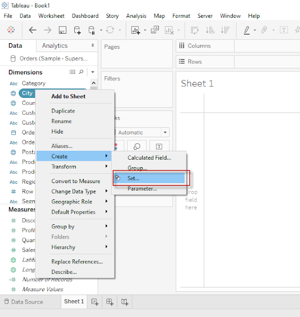
1. Create a Set of Top 10 Cities based on Profit see in Below images  - 

Top N Analysis step 1


2. Give any Name for your newly created Set, and select Top 10 in By Field Section from Create Set pop - 

Top N Analysis step 2

3. Add Newly created Field from sets to Column Shelve and add Sales and Profit in Row Shelve 

4. Click on Drop down for Sum(Profit) as shown in below image and Choose Dual Axis to create a Dual Axis Chart
  
Top N Analysis step 3

5. See Below Analysis created by above step, it has Sales and Profit for top 10 Cities(Who has highest profit)

Top N Analysis step 4

Labels: , , ,

Saturday, May 9, 2020

Different Type of Filters in Tableau

Filters are generally used to restrict the number of records available in data source. In other words Filters are use to create subset of Data. In Tableau there are Filters available at various level for different purposes. 

Given below are the Filter types available in Tableau

  • Extract Filters
  • Data Source Filters
  • Context Filters
  • Dimensions Filters
  • Measure Filters


Extract Filters :

When we use extract data instead of Live data from data source then we can apply filters at Extract level. 

We already know how to Make a connection to data source and what is the difference between live and Extract data in Tableau. Now we are going to learn Extract filters through simple steps, see below images and description - 

Click here to Read more »

Labels: , , ,

Thursday, May 7, 2020

Learn Creating Sets in Tableau

What is Set

Set is a well defined collection of Values.

In Tableau, Set is a Custom Field which we can create to hold some or all Values of a Column based on a Particular Condition.

We Can create Set out of Variable by following methods
  • Selecting data from List
  • Based on a condition (It includes Condition based on another Field or it could be a Range of Values, or we can also create Formula for that)
  • By Selecting Top/Bottom Number of values.
We can create set of Dimensions only, but condition can be based on Measures as well.

For Example-  We want to select/Create a set of those Cities who has sales (Measure) more than 50Lac or we want to create set of Top 10 Cities based on Profit.

How to create Set in Tableau - 

Click here to Read more »

Labels: , , ,

Sunday, May 3, 2020

Types of Chart available in Show Me Pane - Tableau

Tableau is a very advance Data Analysis and Visualization tool, It makes the data analysis very easy through so many techniques without writing any code. One of the very advance feature of Tableau is "Show Me". In "Show Me" we can choose and apply required view on existing data in worksheet.

Those view can be any like Pie Chart, Heat Map, Globe Map, Horizontal/stacked/Side-by-side Bars, Tree Map, Circle View, Area Chart, Gant Chart and many more.

Click here to Read more »

Labels: , , ,

Creating First Visualization in Tableau

Hello Folks - Now we are able to understand basic Concepts of Tableau i.e. What is Tableau and how to start working on this. we know the Component of Tableau Desktop, Now its time to Learn how to create Visualization in Tableau Desktop, also i am going to show how to publish your work on Tableau Public.

When we install Tableau Desktop, it also provide Sample Data of a Superstore for learning purpose, we are going to use that data for this tutorial.

Click here to learn How to connect to a Data source in Tableau then proceed further for Visualization.

After connecting to Sample Data and open Orders in Data Pane, Click on Extract button to Extract
Click here to Read more »

Labels: , , ,

Sunday, April 26, 2020

Dimensions & Measures in Tableau


There are two types of Variables in Tableau - Every variable is categorized in tableau automatically either under dimension or Measures

Let's understand the difference between Dimension and Measure in detail -

Dimensions -

Any Variable with qualitative/Categorical information will be treated as dimension by default in Tableau.
It produce the header when we add this variable to Row Column shelve in Worksheet.

The Actual Definition of dimension is - A dimension is a field that can be considered an independent variable.

To understand it simply any Value Containing any text, date, Geographical location, Boolean value etc are considered as Dimension.

Click here to Read more »

Labels: , , ,

How to Edit Datatype of a Column/Variable in Tableau

Tableau is very smart software, it automatically detect and assign datatype to Variables while making connection with data source.
However, it also provide facility to Change datatype of variable, sometime we need data to be in a particular datatype so here are some stages in which we change datatype of existing variable-

From Datasource Page

First option to change the datatype of a variable is from Datasource Pane, Click on Datatype icon of a variable in data source pane and choose datatype from dropdown list, this is how we can change the datatype from datasource pane. See below screenshot-
datatype from datasource pane

Click here to Read more »

Labels: , , ,

Saturday, April 25, 2020

Types of Variable in Tableau - Datatypes

There are seven primary Datatypes Available in Tableau.

1. String values
2. Number (Integer) values
3. Date values
4. Date & Time values
5. Boolean values
6. Geographic values
7. Cluster or mixed values

When we load our Data or Connect tableau with Data source then Tableau is Smart enough to detect the type of data automatically, Each column/variable is assigned with a different symbol of distinct data type and we can identify the datatype easily.
Tableau also provide the ability to change the datatype from the dropdown in Datapane as shown Below - 
Click here to Read more »

Labels: , , ,

Sunday, April 19, 2020

Difference Between Live Connection and Extract Data

Live: 

  • This allows real time data for analysis from available data source. 
  • It is also known as real time Extract A live connection is a query that underlying data in the data source/database. 
  • When we refresh the visualisation that gives the latest results. 
  • Data is not copied to Tableau Server for preprocessing.
Click here to Read more »

Labels: , , ,

Connect to a Data Source in Tableau


Here we will see how to connect with a Data source Like MS Excel:

When we install Tableau Desktop it provides a Sample Data of a Superstore by default to practice and Learn Tableau:
That is available in your tableau folder on following location:
C:\Program Files\Tableau\Tableau 2020.1\defaults\Datasources\Sample - Superstore.xlsx

We will practice all the exercise and Learn through this data in this and upcoming posts:

Lets follow the below points to connect to the data source to the Tableau
Click here to Read more »

Labels: , , ,

Component of Tableau Desktop

See Below screenshot and find the different Component when you open Tableau for the first time:

Tableau Desktop
First Screen
Click here to Read more »

Labels: , , ,

What is Tableau, How to start working on Tableau


What is Tableau? 

Tableau is Most Powerful and most Trending tool now a days for data Visualization, Which helps in Business Intelligence Process to understand the data in Simpler way and to Make Quick Business Decisions to grow Business and Performance.
Click here to Read more »

Labels: , , ,